Let’s start with a brief summary of what is UX and UI Design, and what is it for.
It is the branch of the development of an interface where we see the aspects of usability and aesthetics, on the one hand, the “User Experience” UX: Design of the interaction, wireframes or schematics prototypes, information architecture, the search of users, and the different scenarios of the interface. On the other hand, there is the “User Interface” UI: which designs the visuals, colors, graphic design, layouts, typography, etc. A combination of these from the beginning of a project will create quality products for your customers.
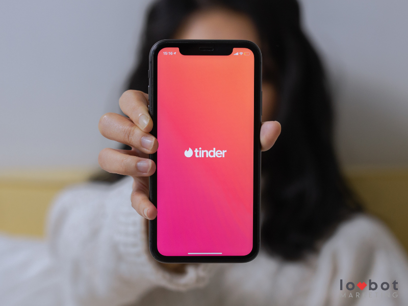
One of the most known platforms either because you are a user or because you have heard hundreds of romantic stories and some other half-scary ones, Tinder is the app that today makes us come to share our opinion and put it as the perfect example of advanced design of a platform, it is amazing that with just ONE FINGER we can navigate, evaluate, select, accept and dismiss, and if we see it in a cinematic way we could say that “Our Love Story we define it with the power of a finger.”
Of course, when you see the result of such a simple interface it would not seem complicated to do the same, but as experts in creating website developments and a CRM paltform, we can share with you that to reach this “simplicity” of use of the app involves going through a complex development process and an exceptional team, so we ADMIRED the work of the TINDER team if you are starting a project we recommend you analyze this app with a clinical eye. What app or website do you consider a good example of UX / UI?


